There was a time when minimal interfaces were the reaction to chaos. Post-Y2K, stripped-back UI became a symbol of clarity. Then came the gloss: skeuomorphism, gradients, drop shadows, and full-bleed backgrounds. And then? Flat design, again.
Now, we’re seeing something different — not a return, but a refinement.
Minimalist interfaces are back in focus, but this time they’re expressive, adaptive, and almost poetic in their restraint. This isn’t emptiness. It’s precision. And it’s reshaping how we interact, feel, and trust the brands we engage with.
What’s emerging is a design language where minimalism is used not to fade away, but to focus.
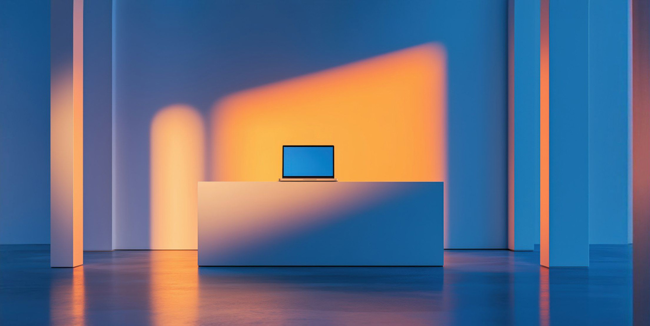
Take tools like Arc browser, Notion, or the onboarding flow of Apple Vision Pro. These products don’t shout. They breathe. They give space. And that space is what makes interaction feel premium.
Minimalism today isn’t blank. It’s intentional. The tiniest motion. A single line of microcopy. A well-timed transition. The goal? Emotional resonance, not feature overload.
In a digital world saturated with noise, what’s not said becomes the loudest signal.
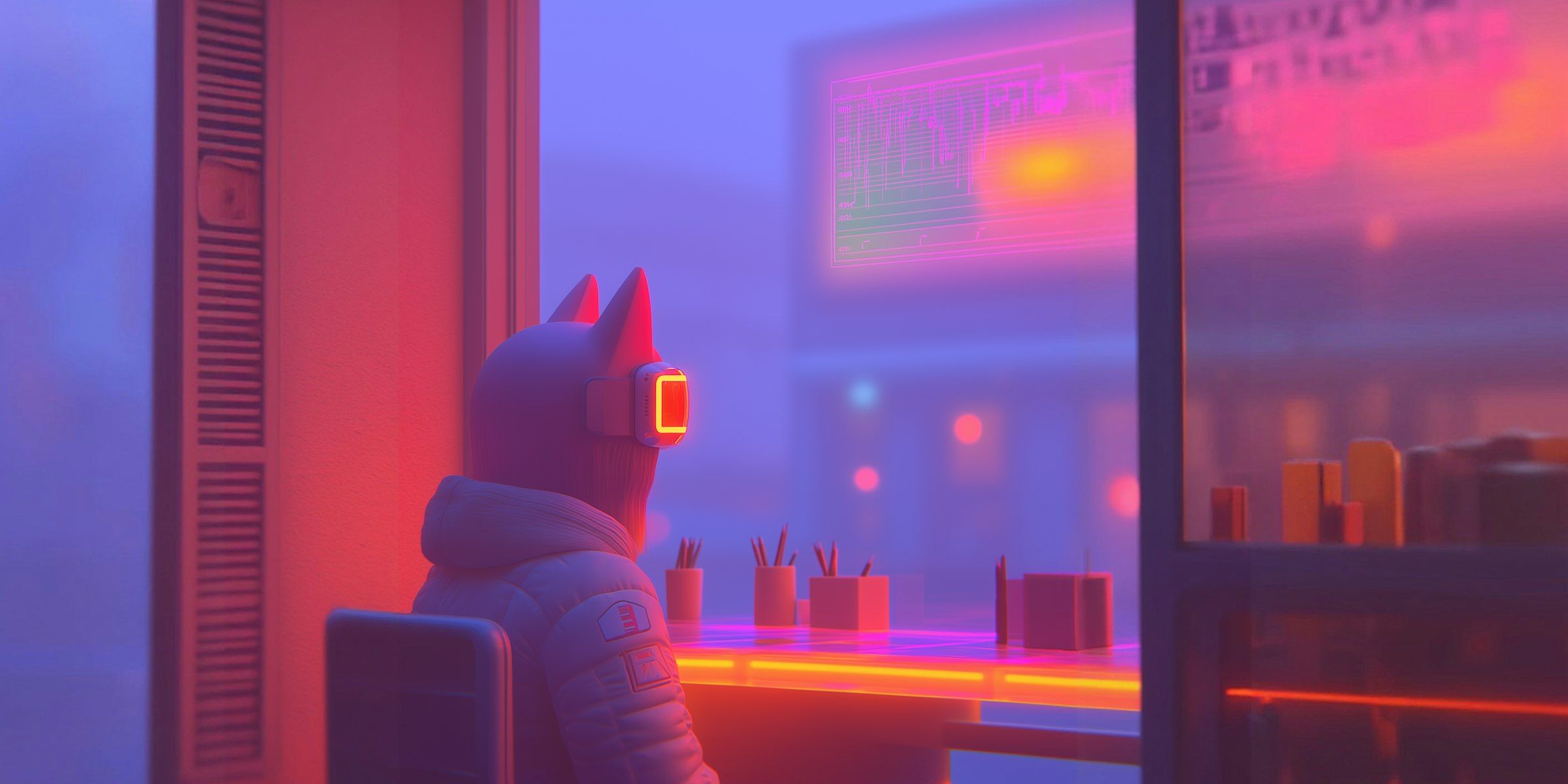
Designers have flirted with maximalist brutalism as a counterculture aesthetic. We’ve seen hacked-together portfolios, Web3 dashboards with monospaced text and glitch effects, and crypto landing pages using every typeface under the sun.
But now, we’re seeing a return to structure — not rigidity, but sensitivity.
Minimalist interfaces today are rounded, soft-edged, and rhythmically spaced. Typography breathes. Interactions feel human. And while the visual load is light, the thinking behind it is anything but.
This is what some are calling “quiet maximalism” — where the interface says less but delivers more, emotionally, cognitively, even culturally.
For brands, minimal UI has become a trust signal.
When banking apps feel calm, or healthcare platforms offer frictionless paths, users engage more. Interfaces that feel considered suggest the organisation behind them is too.
That’s why companies like Stripe, Headspace, and Airbnb continue to invest in invisible design systems — experiences where the tech disappears, and the user simply flows.
There’s an elegance to that. And increasingly, elegance is the brand.
Minimalist interface design is no longer a default. It’s a design decision — one that communicates respect for attention, clarity of purpose, and a deeper understanding of how people feel when they interact.
Call it refined minimalism. Call it silent luxury. Just don’t call it boring.